Anatomy of a Family Room
Thursday, April 19 2012
One of my favorite aspects of my job is the opportunity to create long lasting working relationships with my clients. Often, a client will work on certain rooms in their home, and put others on hold. This was the case for a client of mine whom I have been working with for several years. It was finally time to tackle her Family Room.
I really enjoy working with this client; she has great taste and I feel like I can speak in design “shorthand” because she is quite knowledgeable about it. She also knows what she likes, and is familiar with the fabrics, furniture, and other design elements that are out there (she would probably tell you that this can also be a curse). Since this room had been on hold while her kids were little, she had been collecting ideas and had time to formulate an idea of what she wanted the room to look and feel like.
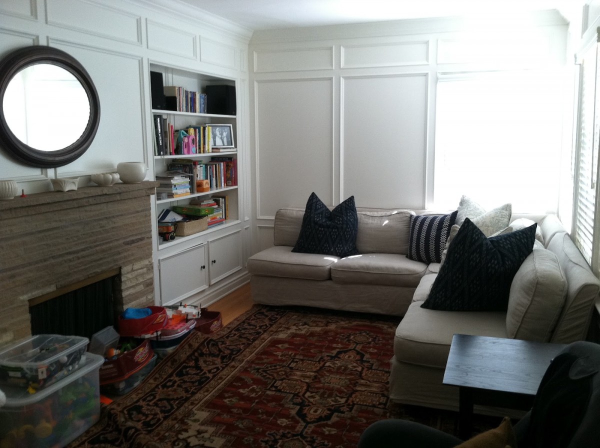
The room had great bones….lots of windows, lovely wood floors and beautiful molding. It is also long and narrow so it was a challenge to make sure my plan made the most of the space.
This is the how the room looked "before"...
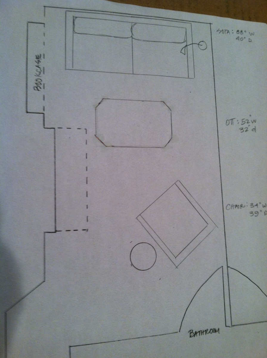
Then came the floor plan. My goal was the maximize the space, and try and use the length of the room since it is longer than wider.
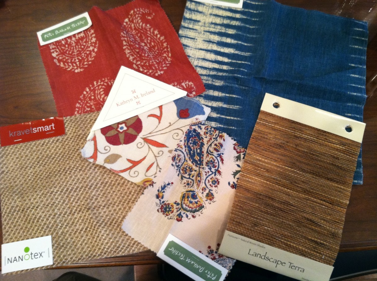
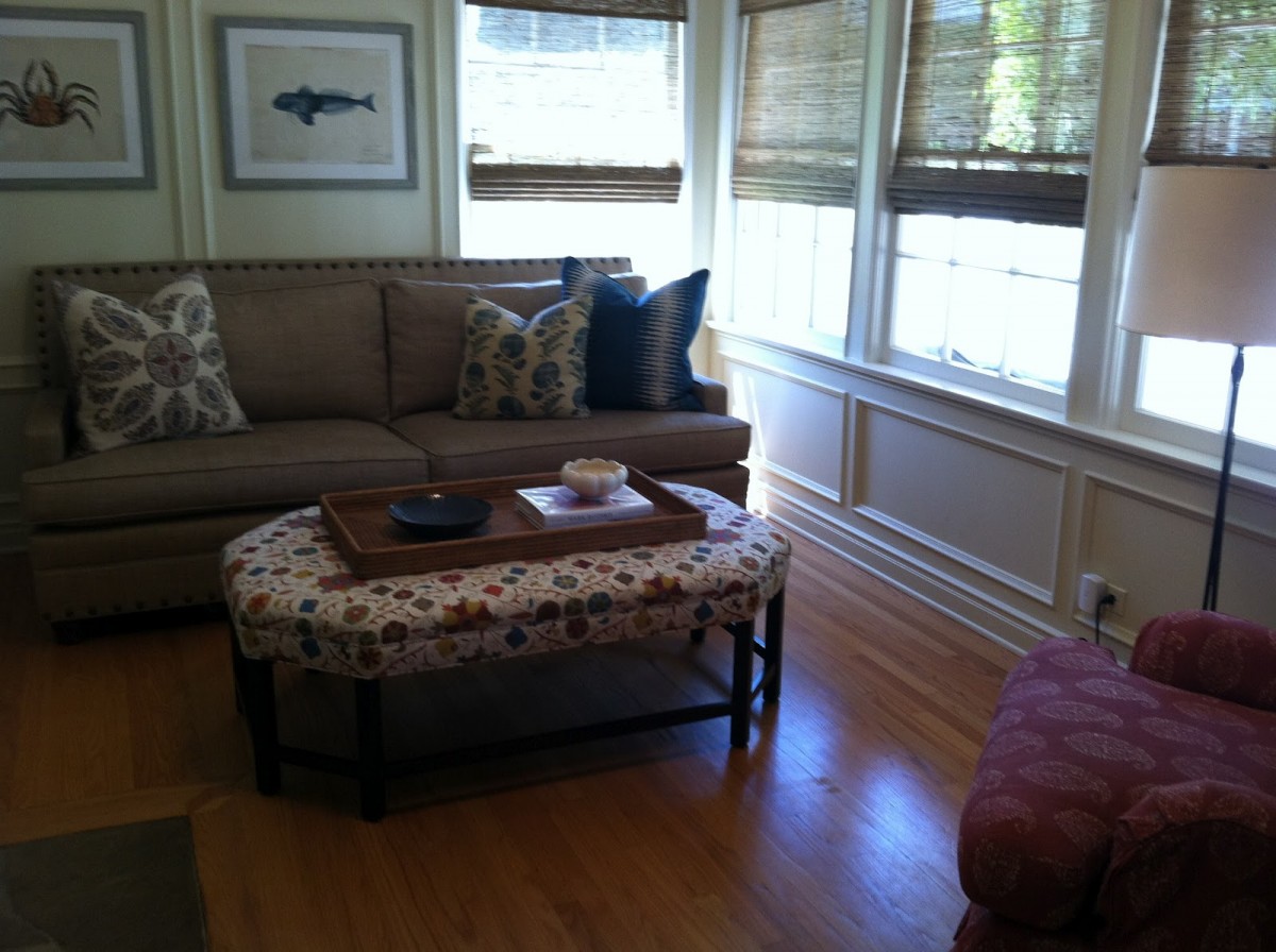
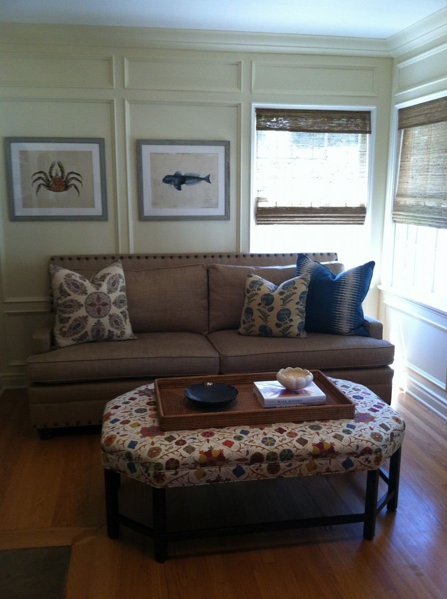
The client wanted an airy, California feeling room. I used Kravet (www.Kravet.com) and Peter Dunham fabrics as well as Kravet and Lee Industries (www.leeindustries.com) furniture pieces. We are both extremely happy with the results...
